
Kodomochi
Shop Branding
Kodomochi is an imagined mochi (Japanese rice cake) shop in Osaka, Japan. The name combines the words kodomo (child) and mochi, as everyone is encouraged to play and build their own mochi monster as a child would.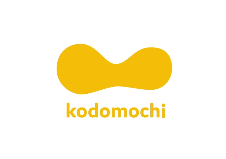
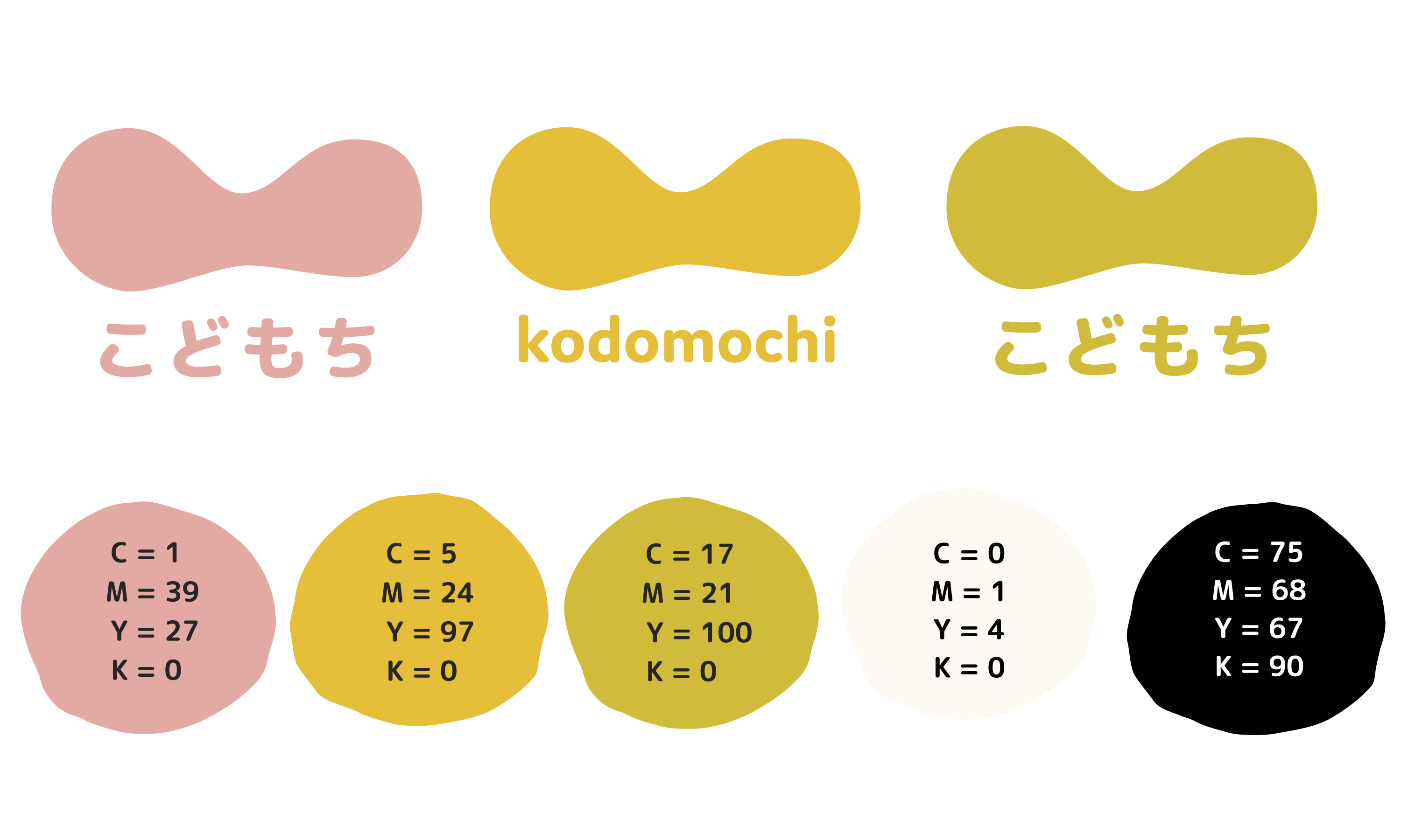
The main motif used throughout is rounded forms to reflect the shape of hand molded mochi. With the theme of create-your-own mochi, the main imagery is of monsters, as the patrons are to ‘frankenstein’ together their own creation. Pink, yellow, and green are all taken from traditional colors of mochi flavors.
When coming up with the logo, I felt that it was important to mimic the shape of mochi being stretched, as that is an iconic attribute that makes mochi so fun and appealing to children. The shape doubles as a smile, emphasizing that creating and playing with mochi is an enjoyable experience.
When coming up with the logo, I felt that it was important to mimic the shape of mochi being stretched, as that is an iconic attribute that makes mochi so fun and appealing to children. The shape doubles as a smile, emphasizing that creating and playing with mochi is an enjoyable experience.
To contribute to the playful and imaginative theme of the shop, the monsters used in the imagery are all hand sketched.
Unique Japanese letterforms used in the poster and brochure were created from craft glue to mimic the blobby and stretched texture of mochi.
Unique Japanese letterforms used in the poster and brochure were created from craft glue to mimic the blobby and stretched texture of mochi.


The catchphrase 「みんなでつくろう」 (minna de tsukuro), translating to "Let's make it together!", is repeated throughout.
A brochure booklet includes information on mochi, including common ingredients, types, and information about the shop, including a menu of ingredients. All text is written in simple Japanese in order to be understood by both children and adults. Because Japanese advertising is still heavily print based, this brochure would be handed out in the streets as well as available inside the shop.
A brochure booklet includes information on mochi, including common ingredients, types, and information about the shop, including a menu of ingredients. All text is written in simple Japanese in order to be understood by both children and adults. Because Japanese advertising is still heavily print based, this brochure would be handed out in the streets as well as available inside the shop.


